Blog details


A beautiful screen is not enough if the customer cannot find the order button. We explain UI versus UX with everyday examples, and how both affect your sales.
You often hear "UI/UX" as if it were one thing, but they are two different sides of design, and each has a direct effect on whether your website or app succeeds. Understanding the difference helps you judge any design you are shown, and know what you are paying for.
UX: can customers get what they want easily?
User experience is about the journey: where customers enter, what they are looking for, how many steps it takes to get there, and where they hesitate or stop. These are mostly invisible decisions, such as the order of pages, the number of form fields, where the order button sits, and what happens when the user makes a mistake.
An everyday example: an ATM that makes you take your card before it gives you the cash. That is a smart UX decision, because it stops you forgetting your card.
UI: is it clear, comfortable and on-brand?
User interface is what you see: colours, fonts, buttons, icons, spacing and images. It is responsible for the screen looking professional, the text being readable, and the user knowing at a glance what can be tapped.
Example: a clear gold order button on a dark background catches the eye immediately. The same button in pale grey may go unnoticed.
Why one is not enough
- Beautiful UI without UX: a visually stunning site, but customers cannot find the prices and the form is long and confusing, so they leave.
- Good UX without UI: the steps make sense, but the look is dated and inconsistent, so customers doubt your professionalism before trying.
Customers do not separate the two; they judge the whole experience in seconds, then decide to stay or leave.
What UX work actually looks like
- Understanding: who are the users, what do they want, what worries them? We talk to you, and to your customers where possible, and study competitors.
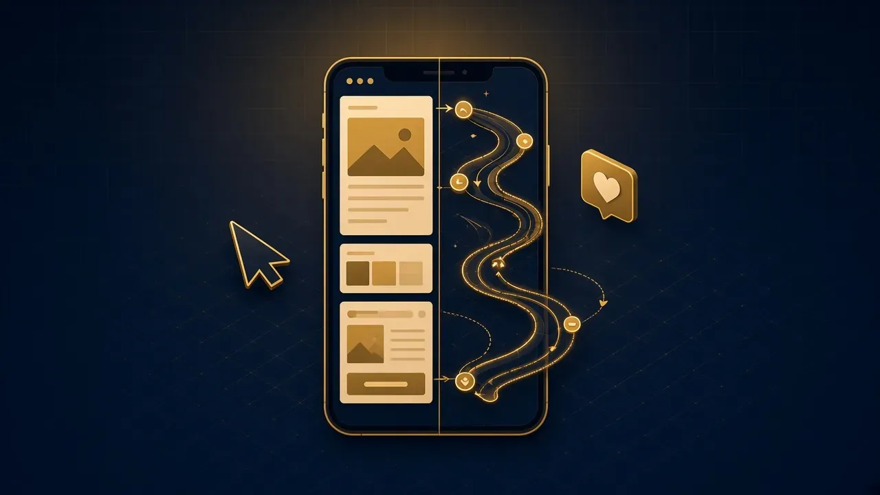
- User journey: we map the steps from first visit to the goal (order, booking, contact).
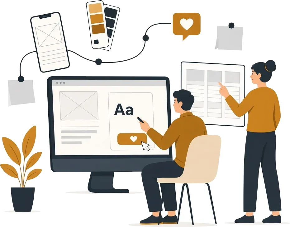
- Wireframes: black-and-white screen structures without colour, to focus on order and content.
- Testing: we show the prototype to real users and watch where they stumble.
And what UI work looks like
- Visual identity: we build on your colours and logo, or propose a direction if you do not have one.
- Design system: a library of buttons, fields and cards in all their states, so every screen stays consistent.
- Final design: screens with real colours, images and text, for every screen size.
- Interactive prototype: you tap and navigate on your phone as if it were a real app, before development.
The particulars of Arabic interfaces
Designing for Arabic is not just flipping an English design. Arabic fonts need different sizes and spacing; icons that point in a direction (such as arrows) must be mirrored, while others (such as a play button) must not. Numbers, dates and currencies have their own rules. These small details are what make a site feel genuinely Arabic rather than translated.
How long it takes, and when to start
UI/UX design for a mid-sized website or app usually takes two to five weeks, depending on the number of screens and the depth of research. The ideal time to start is before development, because changing a screen in the design file takes minutes, while changing it after development takes days. If you already have an app, you can start with a review of the current experience to find the biggest friction points and fix those first.
Accessibility is part of good UX
A good experience works for everyone: people with weaker eyesight who enlarge text, people who use a keyboard instead of a mouse, and people using screen readers. In practice this means enough contrast between text and background, clear labels on every field and button, visible focus outlines, and images described with alternative text. These are not extras: they also help search engines understand your pages, and they make the site easier for every visitor on a small phone in bright sunlight.
How to measure whether a design works
Not by whether you like it, but by numbers: how many visitors completed an order? How long did it take them to find what they wanted? Did repeat customer-service questions go down? Agree with the designer on a measurable goal for every important screen.
What you should receive at the end
- A user-journey map for the main tasks.
- Final screens for mobile, tablet and desktop.
- A design system with reusable components and their states.
- An interactive prototype you can test on your phone.
- A development-ready Figma file with measurements, colours and exported assets.
The bottom line
UX makes the path easy; UI makes it clear and appealing. Together they turn a visitor into a customer. If you have a new project, or an existing app that needs improving, read about our UI/UX design service, or our article on UX mistakes that lose customers.